Color is one of the first and the main things we consider when choosing elements for our home décor. No matter how much we like a certain nuance, it may simply not go well together with the other elements of our interior.
Knowing how to mix and match colors properly is something that designers and architects study for years, but, fortunately, you can learn from them without having to become one yourself.
To make things easier for you and help you turn your dream home into reality, in this article we gathered the most important rules of color use in home décor.
How to Mix and Match Colors in Your Home Décor the Right Way
The rainbow has so many different nuances that choosing elements from your home décor could be quite confusing when you have that variety in front of you. You might find it hard to understand what colors would go well together, especially if you lack experience.
The truth is, it’s really not that hard once you know the basic rules of color theory and how to implement it in your own home.
Below is everything you need to know to create stylish color combinations for gorgeous home décor.
Understand Color Schemes
Color schemes are based on the relationships between the different nuances of the color wheel. Color theory is a big thing in any type of design, and, fortunately, once you understand the basics, it will become quite easy to implement in your home décor.
The main color schemes are based on these basic color relationships in the wheel:
- Complementary colors;
- Analogous;
- Monochromatic Schemes;
- Triads and Tetrads.
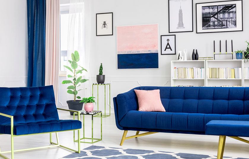
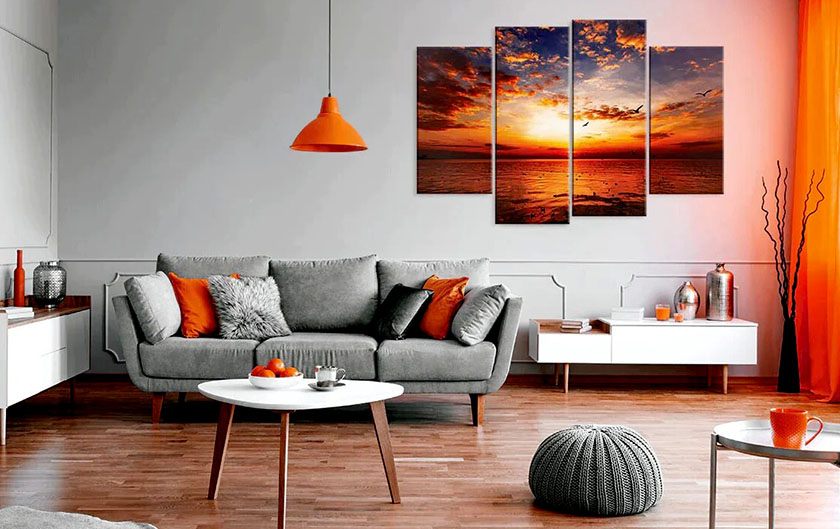
Complementary are those nuances that are exactly opposite to each other on the wheel, such as blue and orange, purple and yellow, and green and red. They complement each other because when they are put next to each other, they visually enhance each other’s vibrance.
Analogous colors stand next to each other in the wheel and they create a smooth and gentle combination. Analogous combinations most often include three colors that stand next to each other.
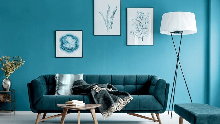
Monochromatic schemes include a neutral base, such as black and white, and a single accent of bright color. They work well with any nuance you choose to be the accent.
Triads and tetrads are color schemes including three and four colors that stand on opposite ends of the wheels. Be careful with those schemes because by choosing too many colors you risk overdoing it and making it too chaotic.
The 60-30-10 Rule
The 60-30-10 is supposed to show you the best proportions for mixing and matching colors in your home décor. The numbers stand for:
- 60% for the main color;
- 30% for the secondary color;
- 10% for an accent nuance.
The main color is meant to bring cohesion to the space and act as a unifying background. This color is meant not as much for decorative elements, as for the large elements such as walls and furniture.
The secondary color is meant to add variety and bring dimension to the space. Choose a nuance that complements your main color from the color wheel, and use it for smaller elements and decorative items.
It’s good to have some accents of a third nuance, reserved only for a few items that pop out. They have a big influence on the visual atmosphere and make the whole look more interesting.
Color Temperature is Key
Color temperature is something often neglected by people who are not professional interior designers or decorators, but it has an immense influence on the whole outlook of the place.
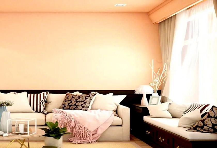
Different nuances and colors can be separated as cool and warm. Warm colors include yellow, red, and orange, while cool ones include blue and certain shades of green and purple.
Nuances of the same color can be cool or warm. For example, there are tones of purple that definitely bring a warmer feeling, while other tones, like lavender, are cooler.
A general rule in interior design and home décor is to keep a good balance between cool and warm tones, and not make everything the same color temperature.
Decide whether you want the general feeling to be cool or warm and use such colors as a base, but balance the temperature by adding elements from the opposite type.
Accents on a Neutral Base
A great way to instantly glow up the place and make it visually appealing is to add décor elements in a vivid nuance that pops out on a neutral base. First, create a monochromatic base using muted neutrals for the larger elements in your interior, and then go wild with the colors of the decoration.
Make sure you group decoration in focal points and don’t spread it chaotically all over the place. Moderation is key if you want the elements to remain visual accents.